

A brand system built from one small unit
Identity, guidelines and applications for Morph, a financial stability app — where one repeated shape turns small habits into a mark in motion.
Morph helps people build financial stability through small, repeatable habits. The identity had to show that idea, not just name it.
I designed the full identity: symbol, wordmark and lockups, a construction system, colour palette, typography and a 16-page brand guidelines document.
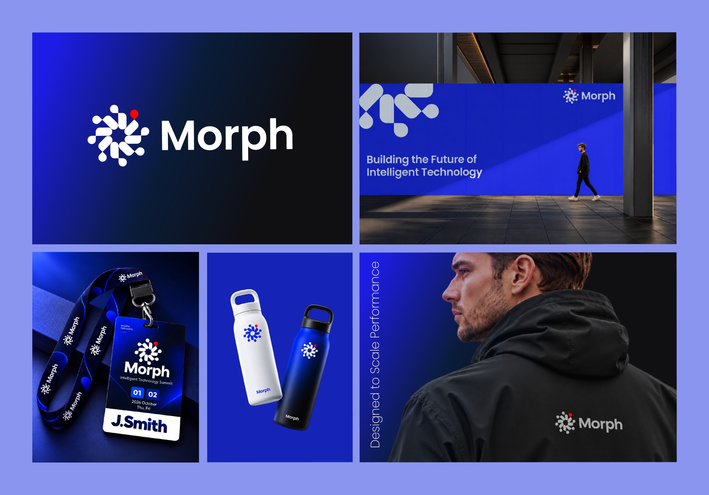
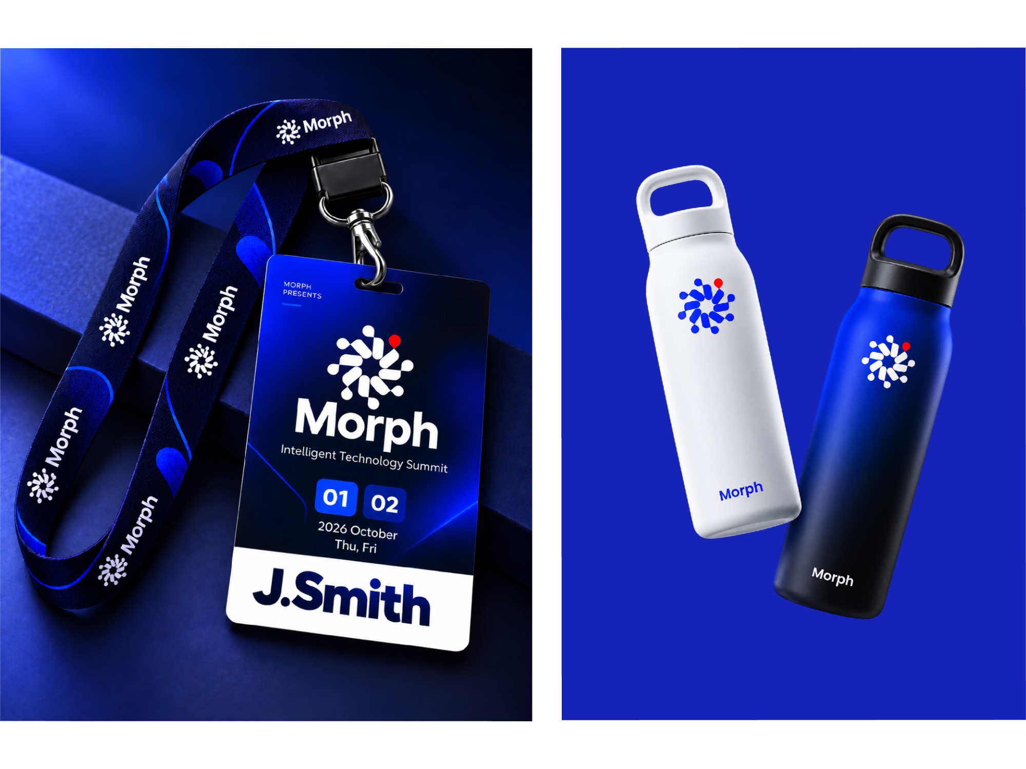
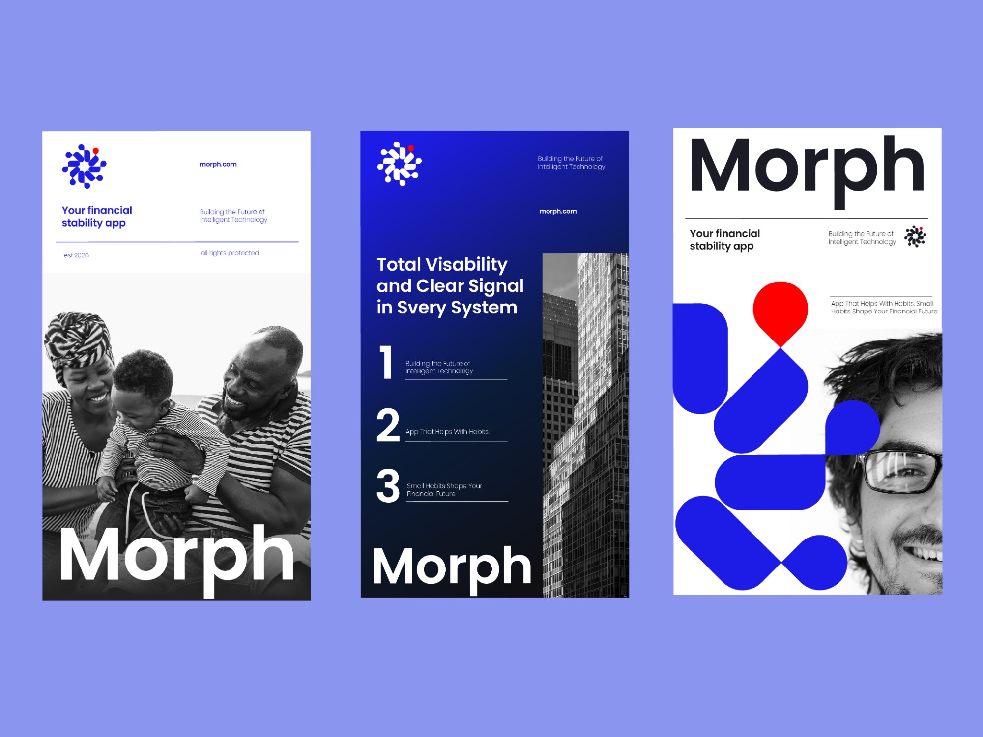
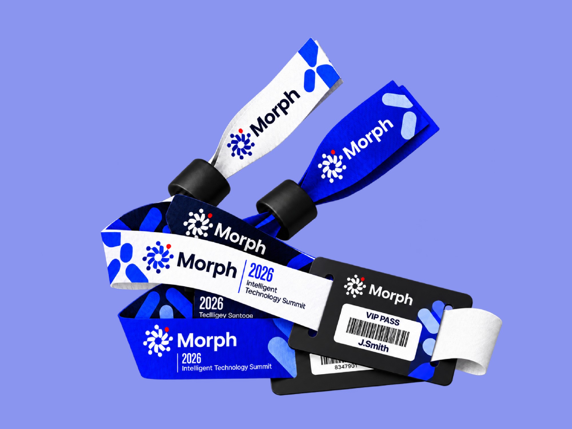
Then I tested it across eight real-world touchpoints — signage, event passes, merchandise, apparel, posters and an app icon — to prove the system holds at every size.
Lasting change is never one big leap. It’s many small actions that compound into momentum — so the logo is built the same way.
A money app about habits
Morph turns everyday financial decisions — a deposit, a check-in, a smarter choice — into lasting progress, guided by clear, timely signals.
Optimistic, yet trusted with money
Fintech brands tend to look either cold and corporate or playful and unserious.
Morph needed to feel human and forward-moving while still earning the trust money demands — and work from an app icon to a building wall.
Change you can see.
Technology that works quietly.
Everything orbits the person.
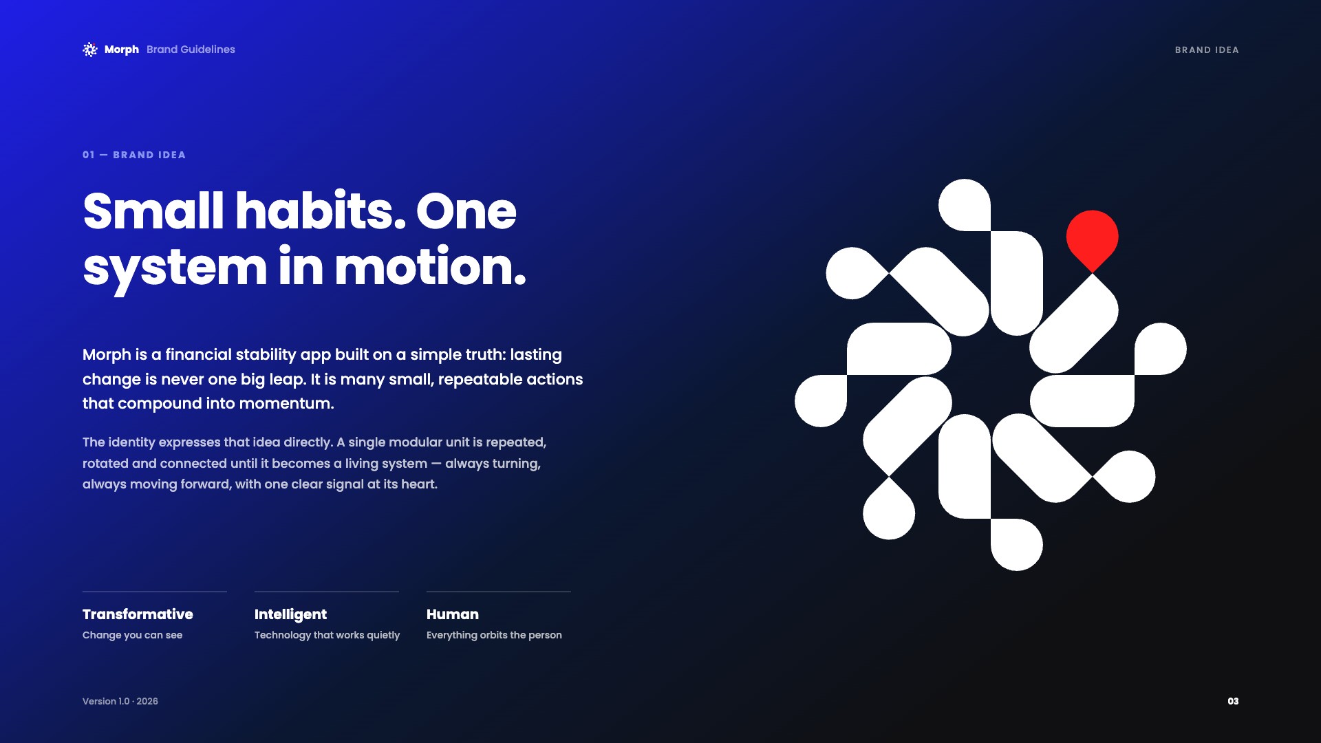
Small habits. One system in motion.
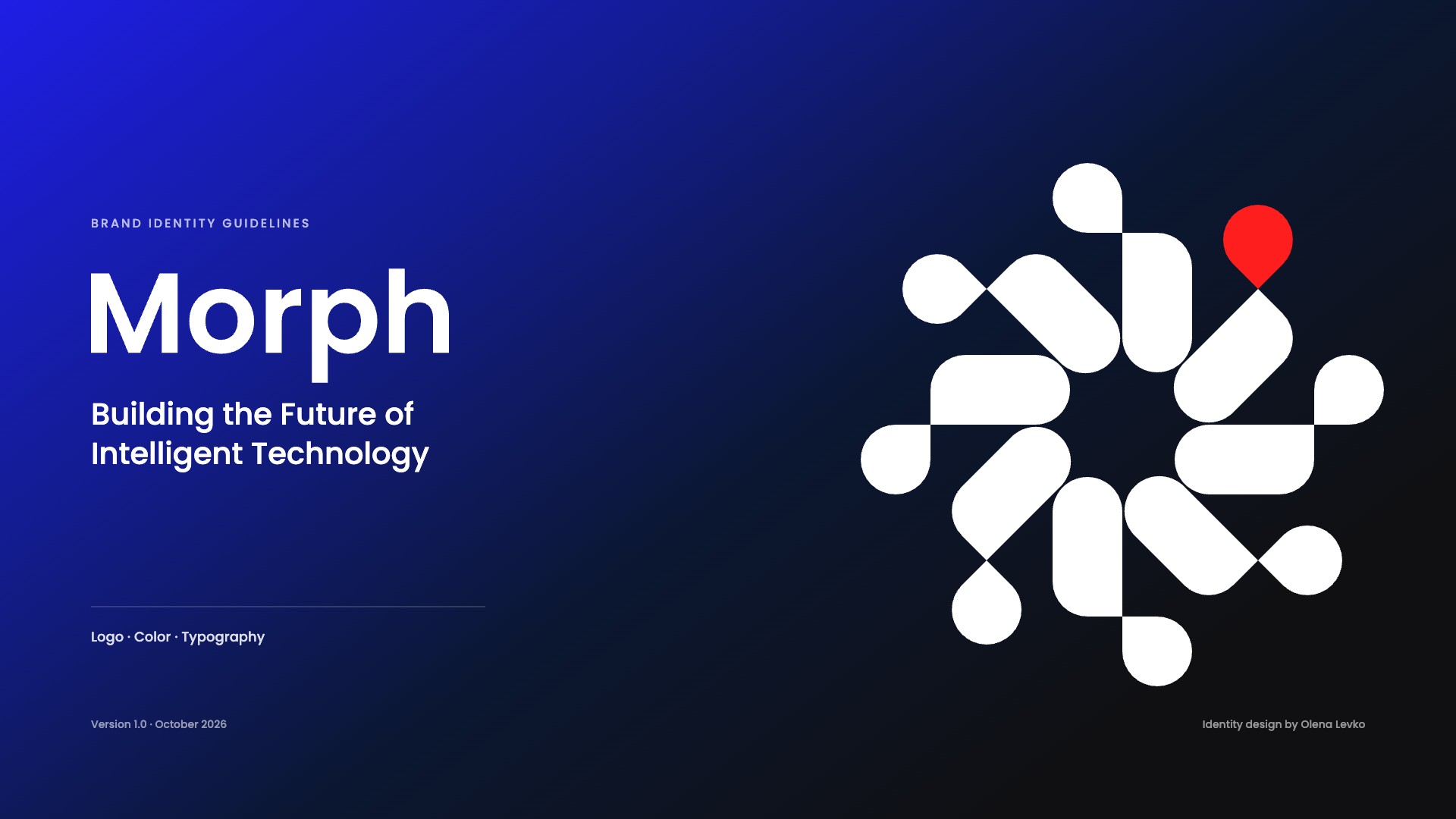
A single modular unit is repeated, rotated and connected until it becomes a living system — always turning, with one clear signal at its heart.
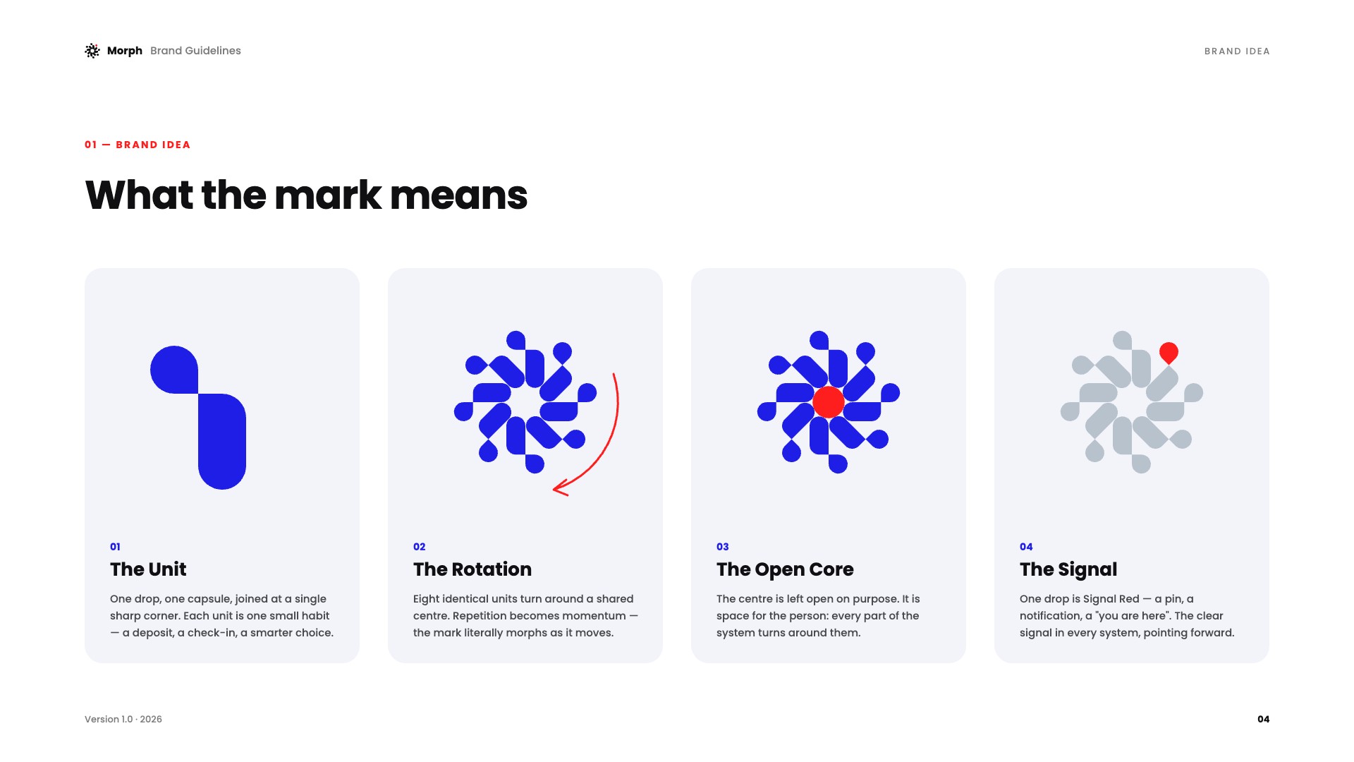
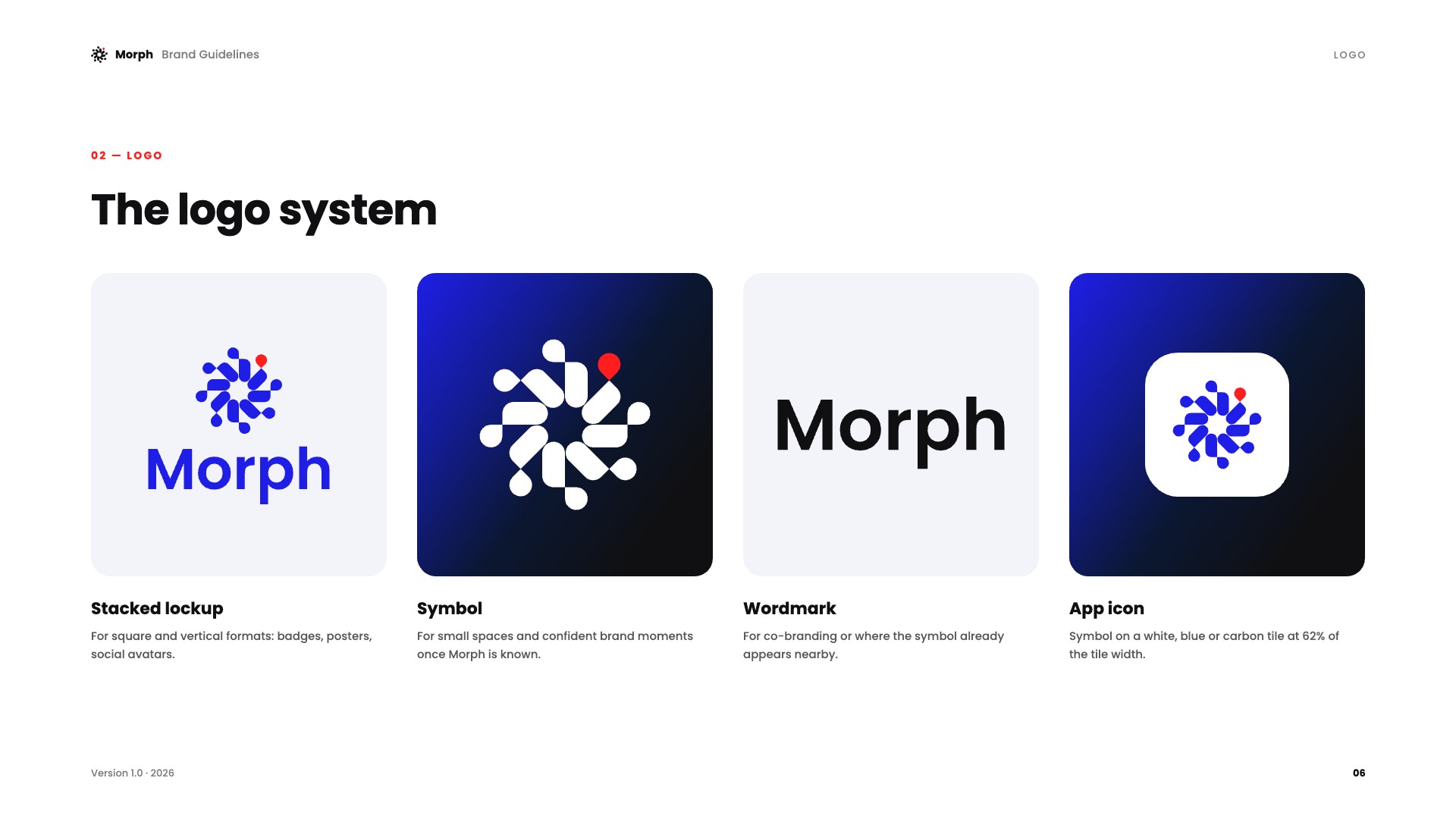
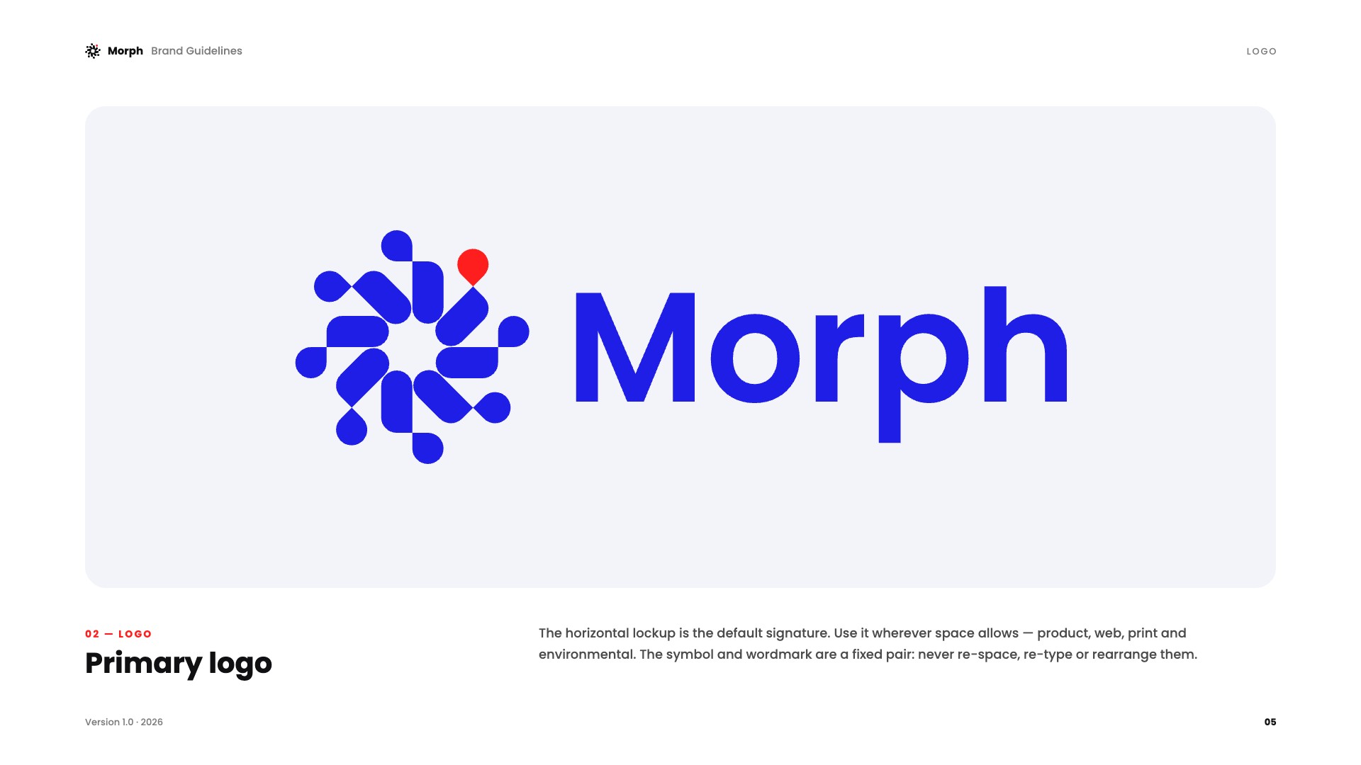
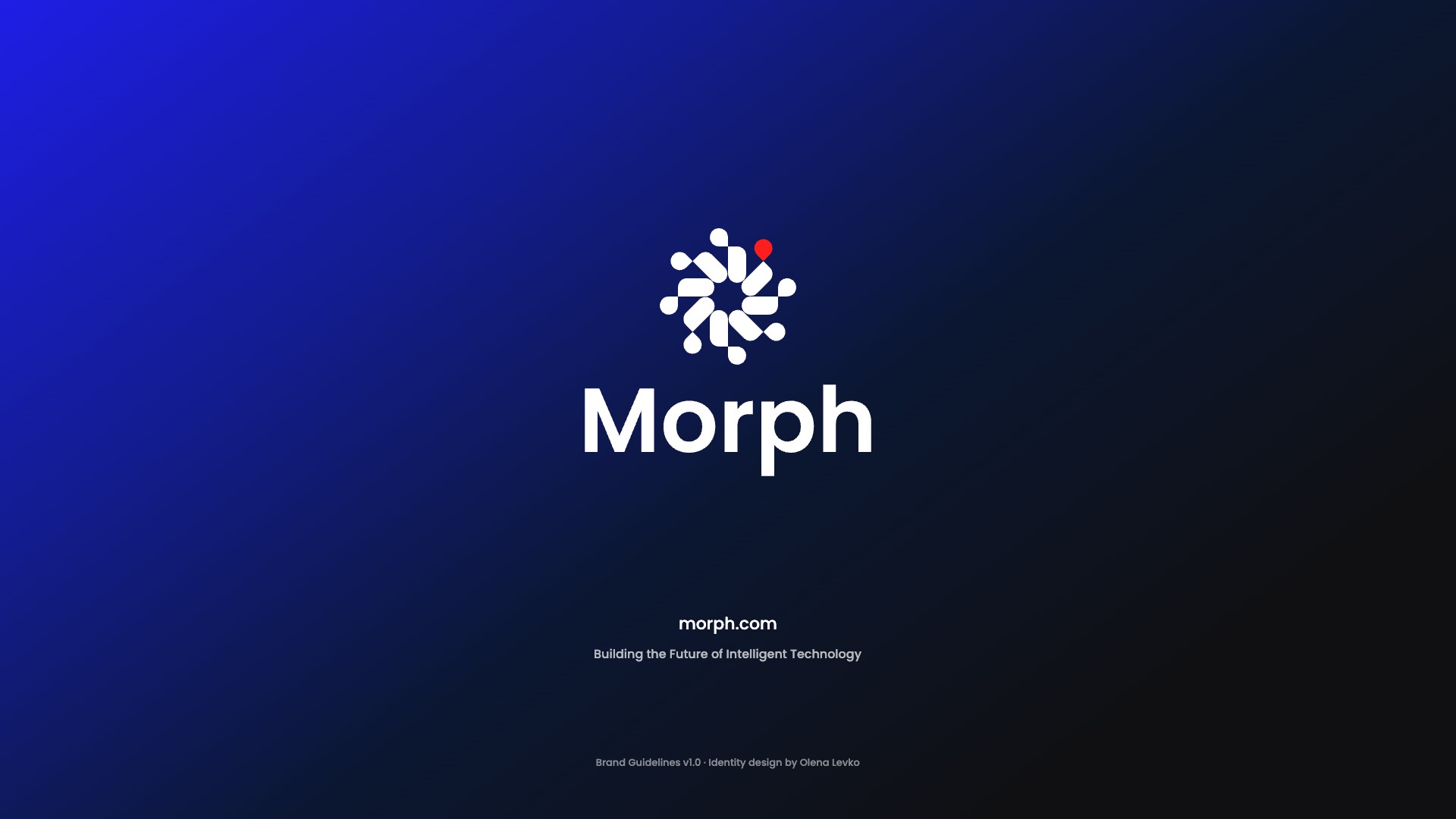
One drop and one capsule joined at a sharp corner. Each unit is one small habit.
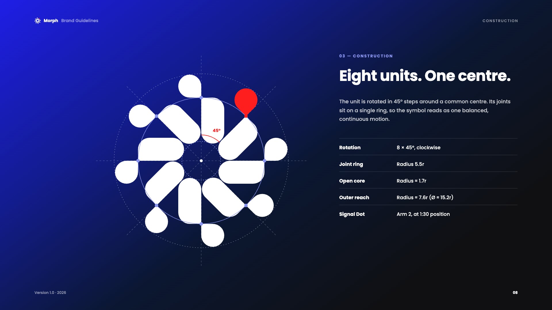
Eight identical units turn around a shared centre. Repetition becomes momentum.
The centre is left open on purpose — space for the person.
One drop in Signal Red: a pin, a notification, a “you are here.”
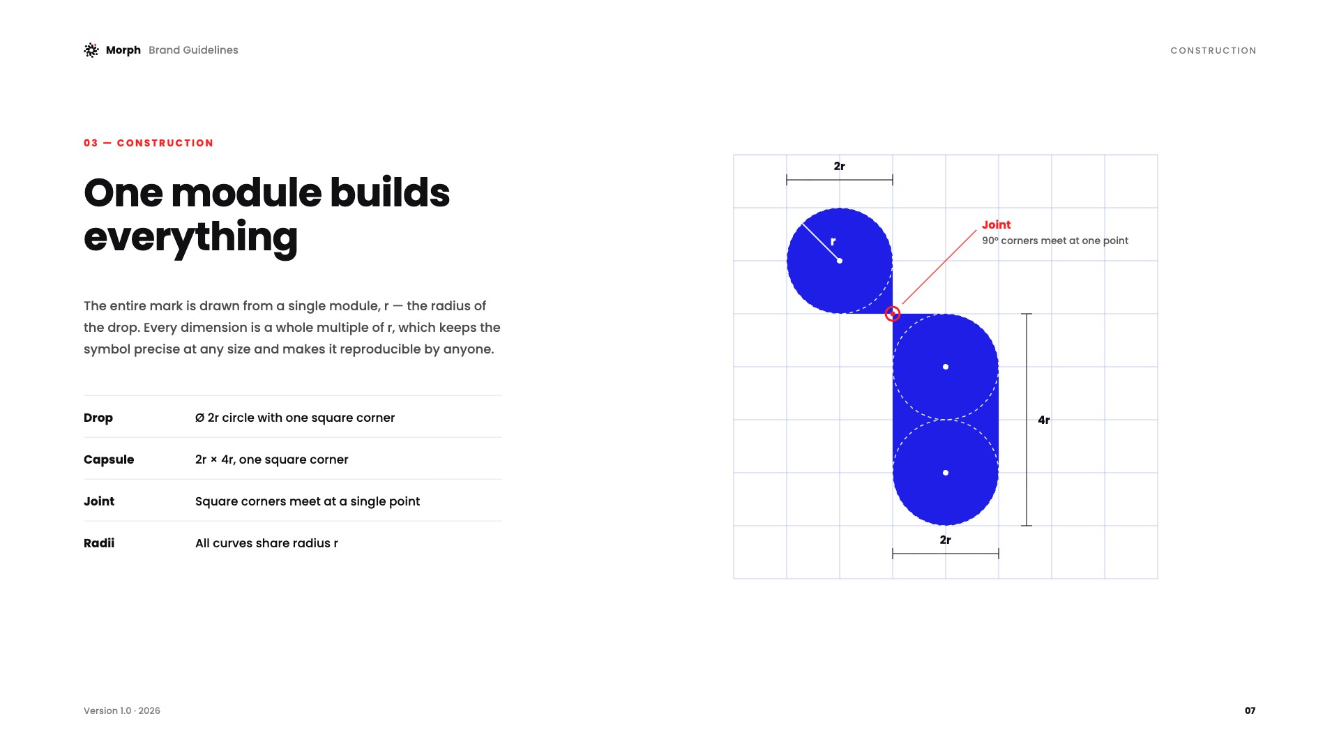
One module builds everything
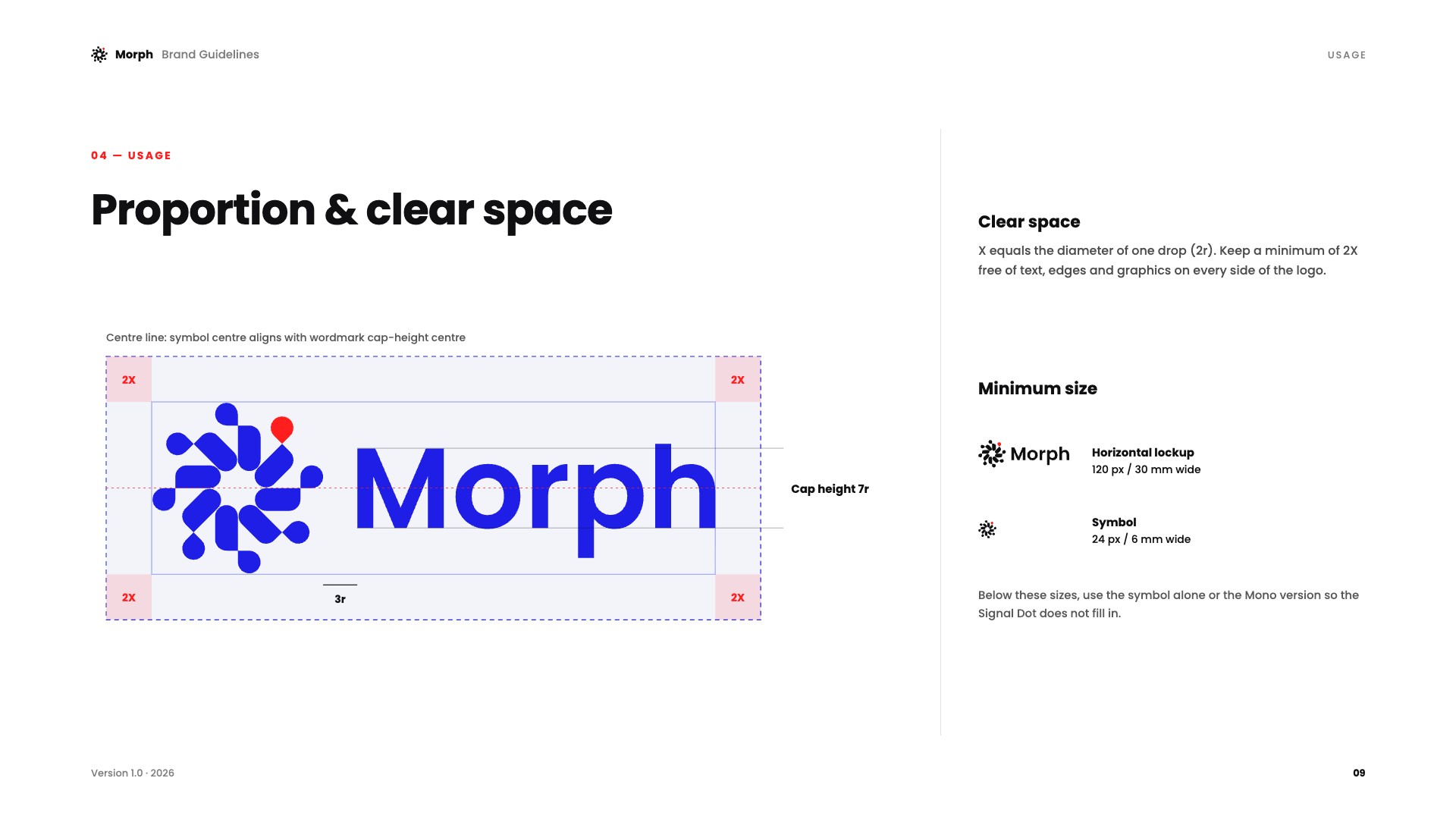
Every dimension is a whole multiple of r — the radius of the drop. The mark stays precise at any size and anyone can redraw it.
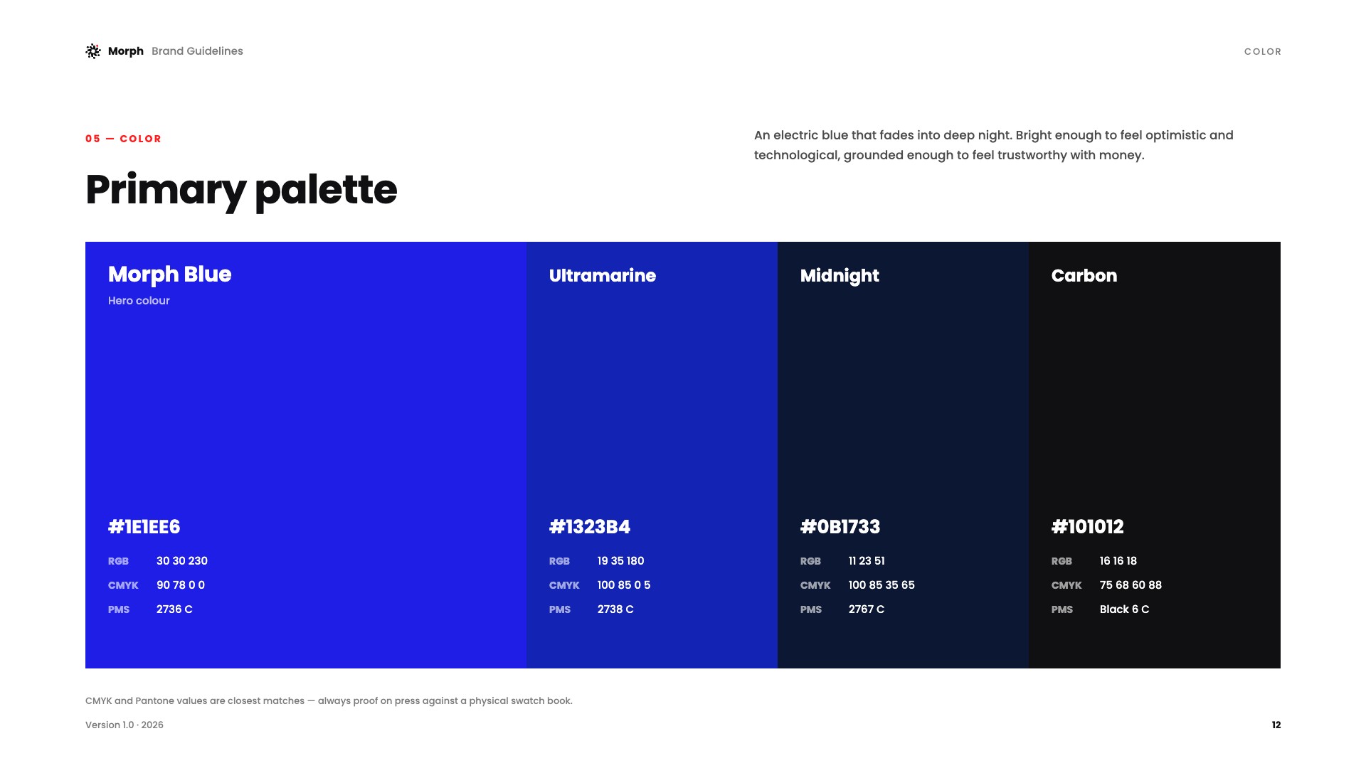
Electric blue that fades into deep night
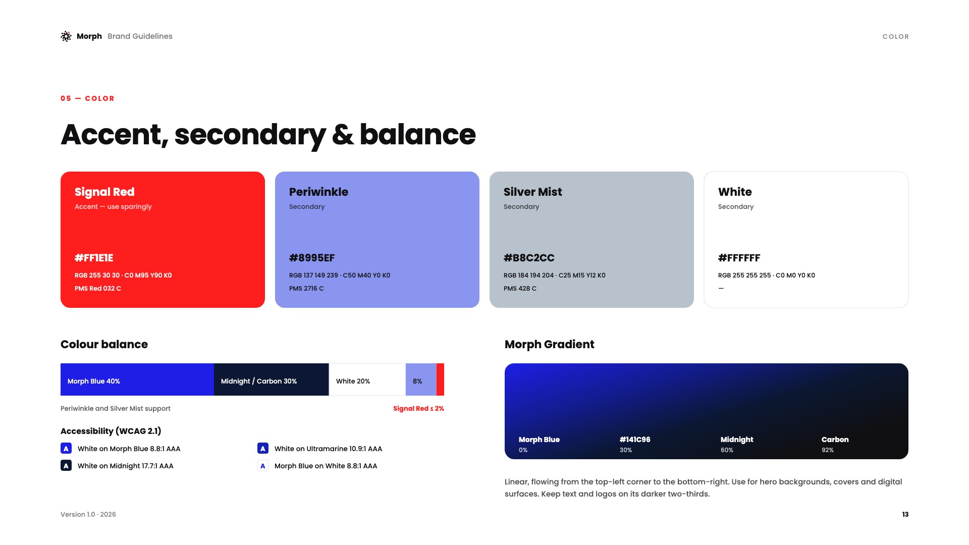
Bright enough to feel optimistic and technological, grounded enough to feel trustworthy with money. Signal Red stays under 2% — so when it appears, it means something.
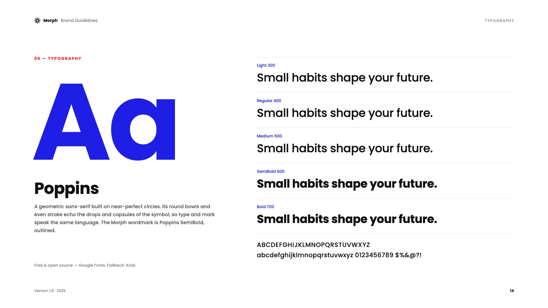
A geometric sans built on near-perfect circles — its round bowls echo the drops and capsules of the symbol.
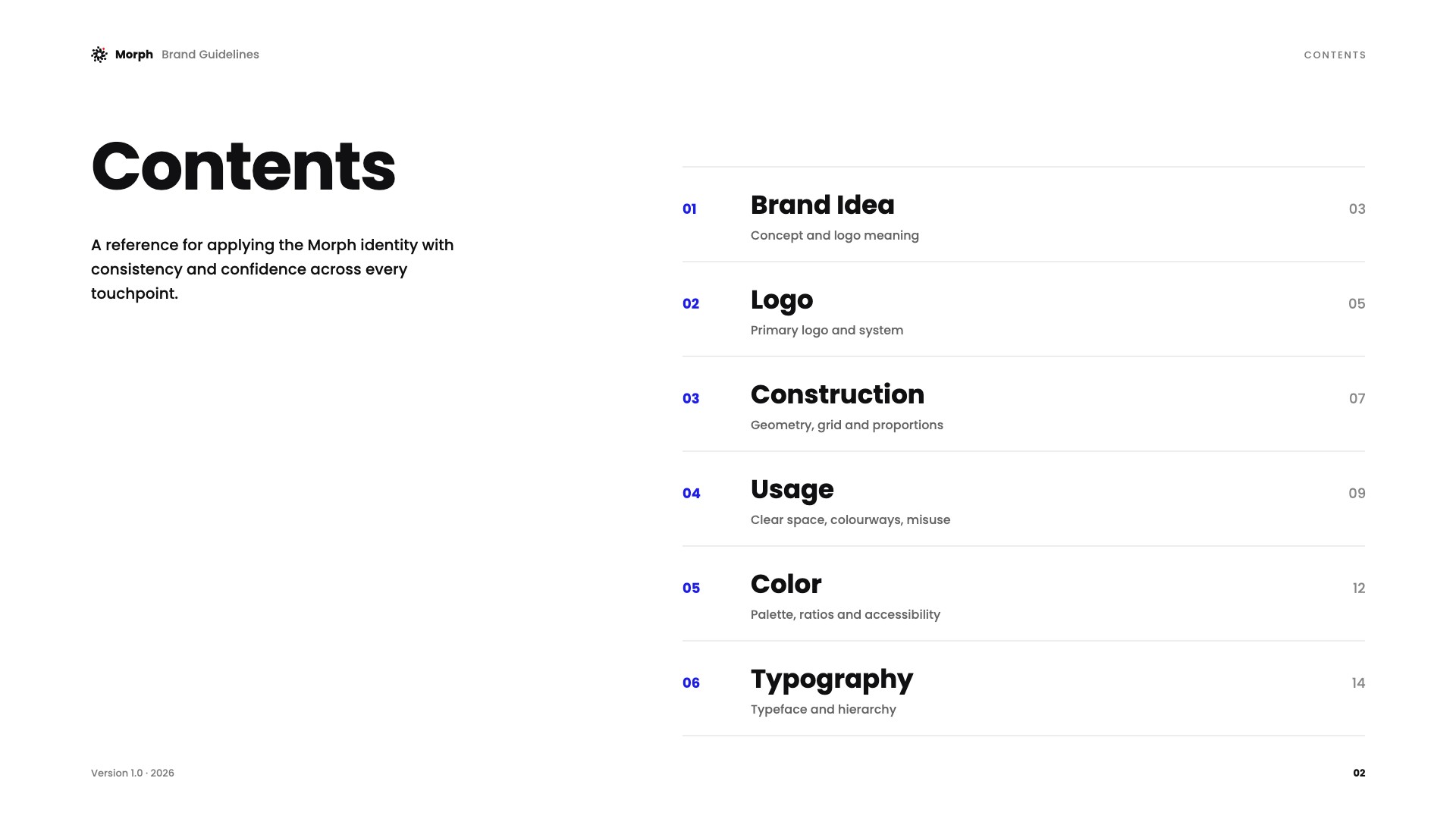
Sixteen pages that keep it consistent
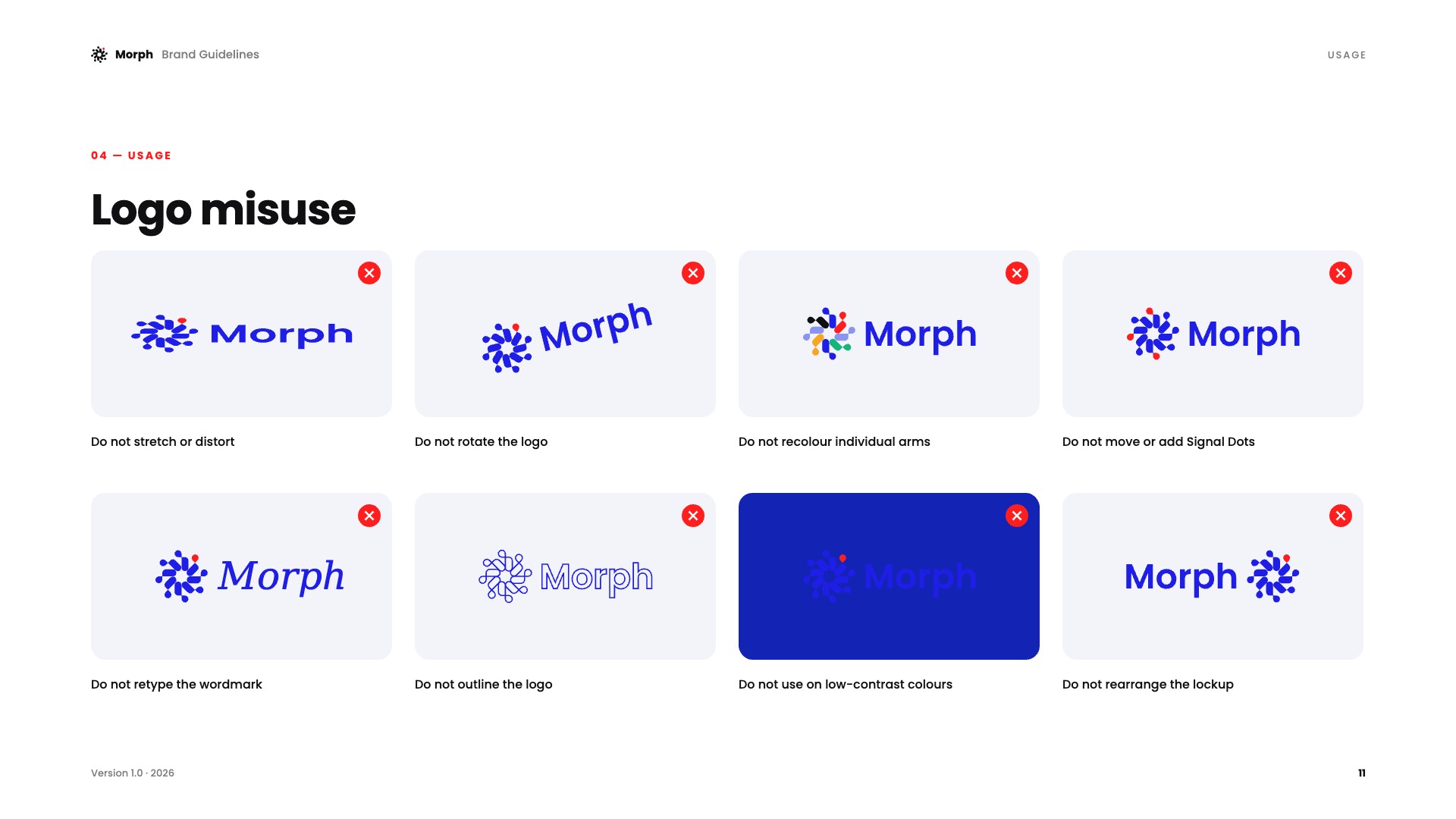
Brand idea, logo system, construction, usage, colour and typography — documented so any designer or developer can apply Morph with confidence.
From an app icon to a building wall
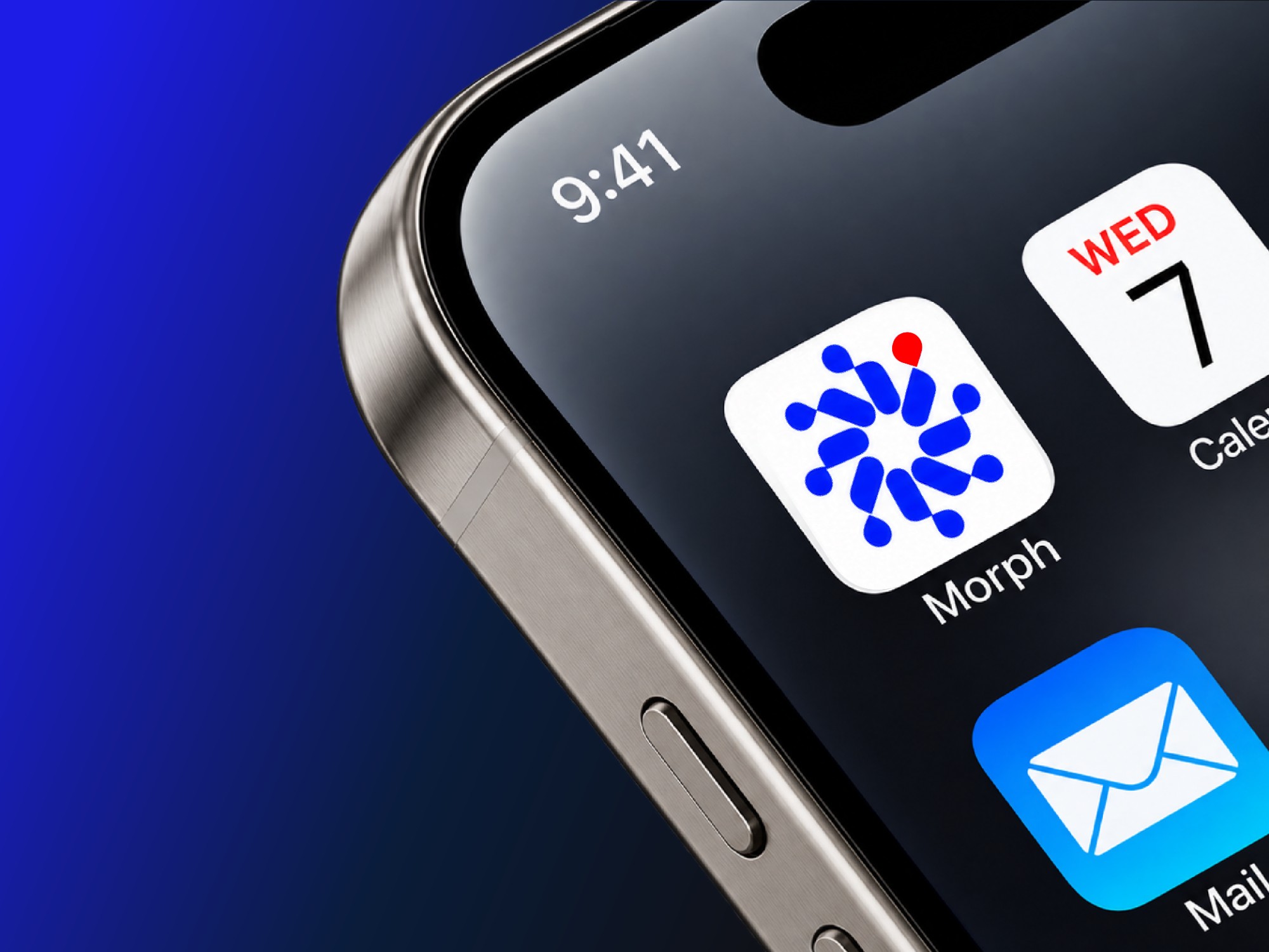
The same eight-unit mark scales from a 24 px app icon to environmental signage — and the supergraphic crop gives every surface its own pattern.

A mark that moves with the brand
Every part of the symbol is drawn from a single radius, r.
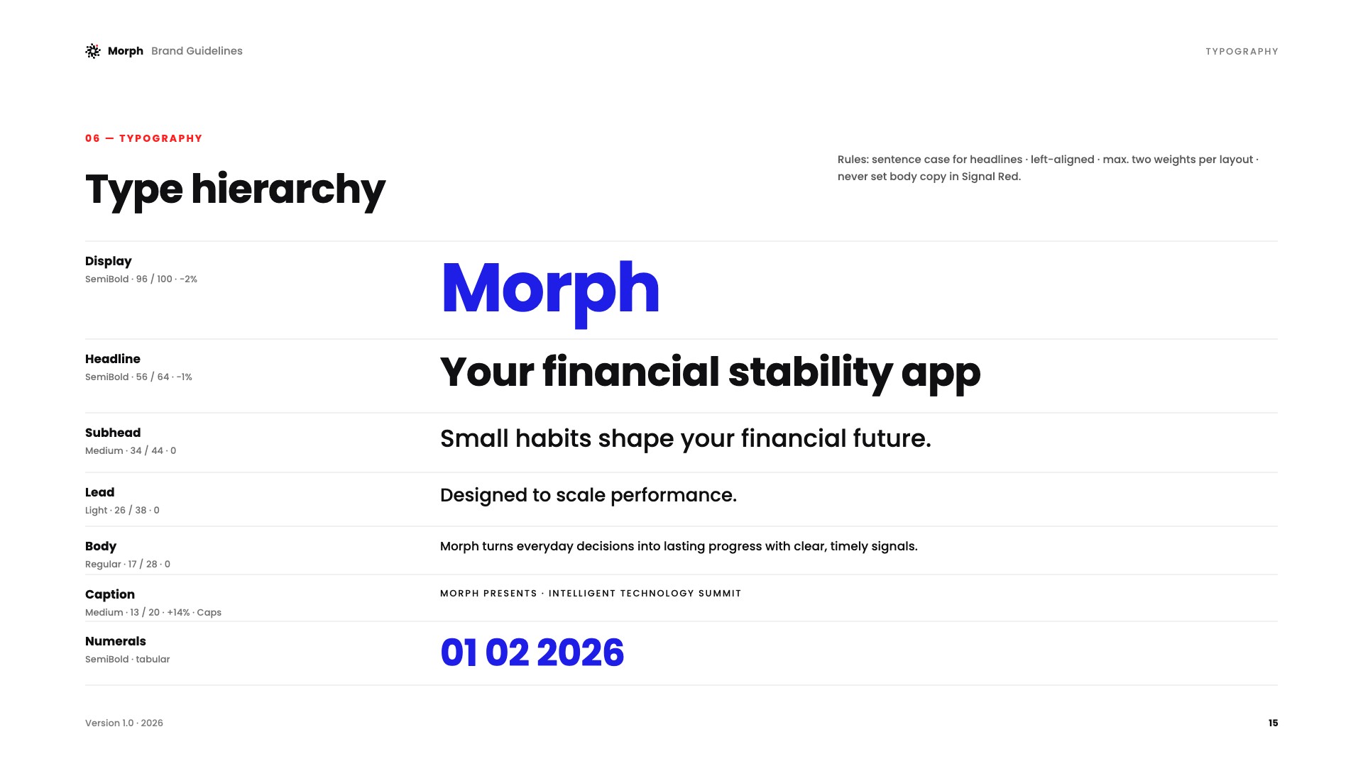
A complete, reproducible system from idea to type hierarchy.
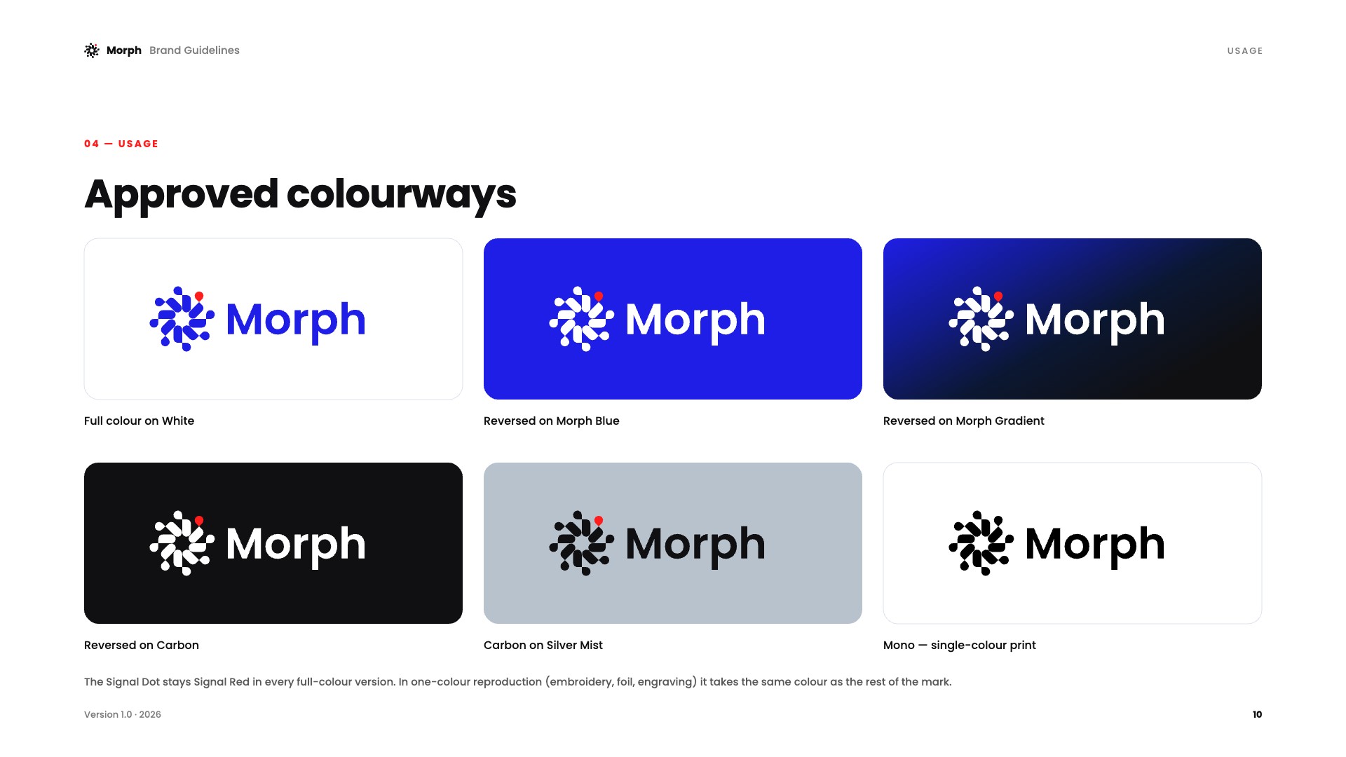
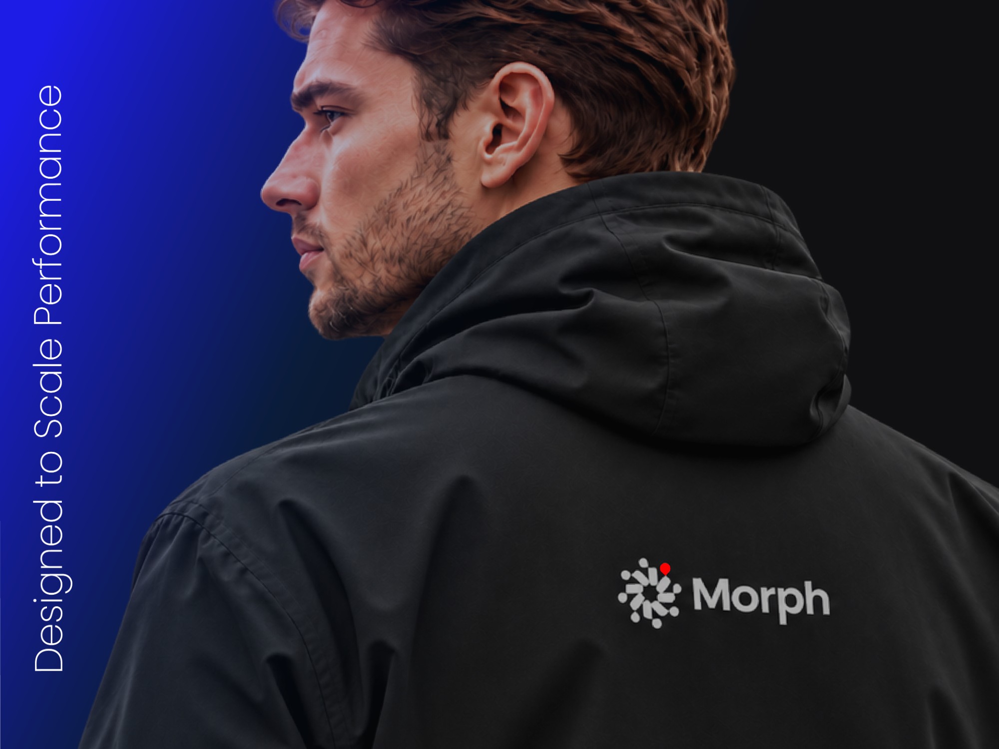
From full colour on white to single-colour embroidery and foil.
Signage, passes, merchandise, apparel, posters and app icon.
Eight small units, one open centre, one red signal — the whole brand promise in a single mark.


